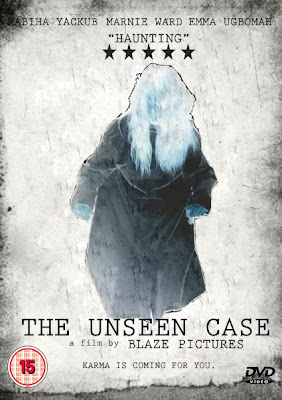
This is the front cover for our opening sequence.
Despite initially agreeing to release our poster in unison with the opening sequence we decided that by releasing it before hand will advertise and promote it before as this is how it works in the film industry. This will ensure that we appeal and attract our target market well before the release of it, but as it is not a full film and only an opening sequence we have still adopted the idea of promoting our opening sequence in order give it the full effect and advertise our whole narrative if we were to create a whole movie.
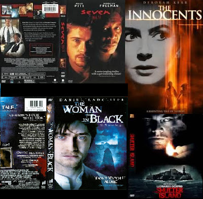
Just like we analysed different aspects to different films, i.e. Mis-en-scene, sound, camerawork etc we also analysed different front covers that would fit will with our opening sequence.
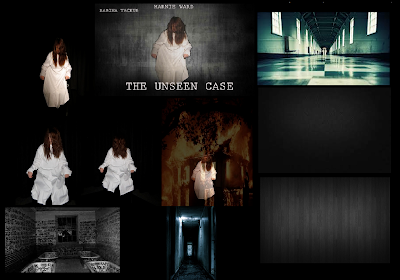
Initially we tried taking pictures from the actual sequence and trying to merge them together in order to give an insight of what the film would be like, but we then felt that this may give away vital scenes that should only be seen once in order to make the audience jump. Through this we came up with the idea of simply taking pictures of our antagonist and keeping it simple resulting in our audience wanting to find out more.
These were among some of the covers that inspired us with what we have created. The different styles of titles, text, pictures, backgrounds, the way the casts name is spread out etc

For our final poster we first thought about taking screen shots of some scenes out of the actual production, but we came across the issue of different lighting and positioning. So we did a small photoshoot of our antagonist as using shots from the sequence was a worry that vital scenes might be given away. We used the research from the target audience and created a character which appealed to thee. The three single pictures of our antagonist were taken at different angles and lighting, these were the ones we thought were the best out of all the ones we took. We decided to go with the picture on the top left as it made our antagonist look vulnerable yet mysterious. After selecting this we tried merging the image of a burning house and the antagonist together to try and explain the burn on her face, but we faced a lot of difficulties as the picture of the house would stand out too much making the other picture disappear, so we decided to play around with other backgrounds to see if it would work better. Then we came up with out first draft of the poster (the second one in from the left, top row). We thought this would work, but it failed to appeal to our sequence and our target audience as it didn't fit the genre. Again by playing around many different backgrounds on photoshop we came up with the final product to which we all were satisfied with. The final product didn't give away too much and gives a small clue to our target audience about what its about. By making it negative it makes more mysterious as throughout the opening sequence her full face again isn't visible.
